In our article on Six Sigma Pareto Charts we discussed how such charts could be used to display information such as route cause data.
In this article we’ll take a look at an example showing how a chart can be constructed.
For the purposes of the example we’re investigating customer rejections of goods sent by our organization. 152 data points have been collated and grouped into 5 categories. The data was captured over a 3 week period and is the following
Damaged Packaging 42 Occurrences
Parts received too early 5 Occurrences
Incorrect Documents 52 Occurrences
Incomplete Parts sent 12 Occurrences
Incorrect Part sent 17 Occurrences
In Excel we create a new workbook and enter the data shown above in a table (see picture) In the example we’ve sorted the data horizontally running highest occurrences to lowest – left to right.
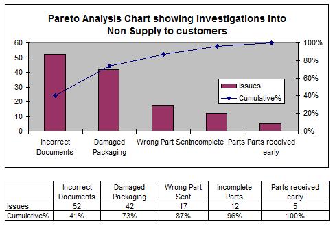
We add a calculation to calculate the cumulative percentage for each issue type. This is calculated by summing the total number of Issues (in this case 128) and then by adding the Issues together as we move along so in this case we had 52 occurrences of incorrect documents (52/128 giving us 41%), we then had 42 occurrences of damaged packaging (so that’s 42 + 52 (from incorrect documents) = 94 / 128 giving us 73%) and so on.
We now create a chart – in the example we create a Custom Type – Line / Column on two axes – On the left we have the number of occurrences and on the right we have the Cumulative %. We add a title to our chart
As discussed – Pareto Charts are typically used in route cause investigations – as you can see from the finished results – our Pareto Analysis chart more than adequately conveys the significant causes of our business issue – improvement teams can then use this information to prioritize their activity.


