Affinity Diagrams are a great easy to use tool used to group together ideas or issues. They are often used at the end of Brainstorming sessions to show trends based on grouped results of the discussions.
In this article we’ll take a look at an example using some pictures we took following a brainstorming session.
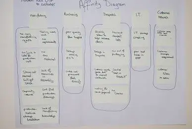
Just to repeat from previous articles – you don’t need any special tools for this just some paper (we used a flip chart pad), some pens, and some sticky notes. Our completed affinity diagram can be seen below.
The business had a fairly common problem: it was suffering from poor delivery to it’s customers and as a result was holding a series of improvement events to understand the depth of the problem and its causes.
A brainstorming session was had with a number of team leaders from the shop floor who were asked what issues affected them achieving target dates (which were controlled by the request date of the sales order and subsequently by the company ERP system). This brainstorming session was one of a few which were carried out utilizing various staff from different levels within the company.
During the Brainstorming session we captured all of the issues and then used an Affinity diagram to group them into something we could take the execs through.
The process of building an affinity diagram
I’m not sure there’s a hard and fast rule on how to produce affinity diagrams – this was our approach.
1/ The tools of the trade – Pens, Paper, sticky notes
2/ We held a brief overview of the business issue – delivered some metrics to back it up and then held some discussions about what went on to contribute to the problem. We encouraged everyone to take part and emphasised that this wasn’t a blaming session merely a “tell us the issues” session
3/ We encouraged everyone to write up the issues that they saw onto their post it notes and place it anywhere they liked on the paper

4/ This continued until we ran out of issues
5/ We then started to relate these into groups. Due to the ways the issues fell out we grouped them by department – as you can see we had quite a few manufacturing problems which caused delays in production process
6/ Once we’d finished we captured the chart using Visio.
We put a video together on the process that you can watch below.


